background
Bundles are a product featured on select product pages with the main goal of showing the customer products that go with the current product (e.g. rug pads to go with rugs, comforter sets to go with sheets). In addition to updating the old design, I was tasked with supporting functionality that would allow for quantity bundles; bundles where the customer will receive a discount for purchasing multiples of the same product (e.g. 4 bar stools).
process / research
First steps for the bundle redesign included reviewing prior research on the bundles feature, as well as coordinating with both the business and development teams within the Product Details Page team.
I wanted to be sure that I understood what was tested previously and why, and where we wanted to go with this feature.
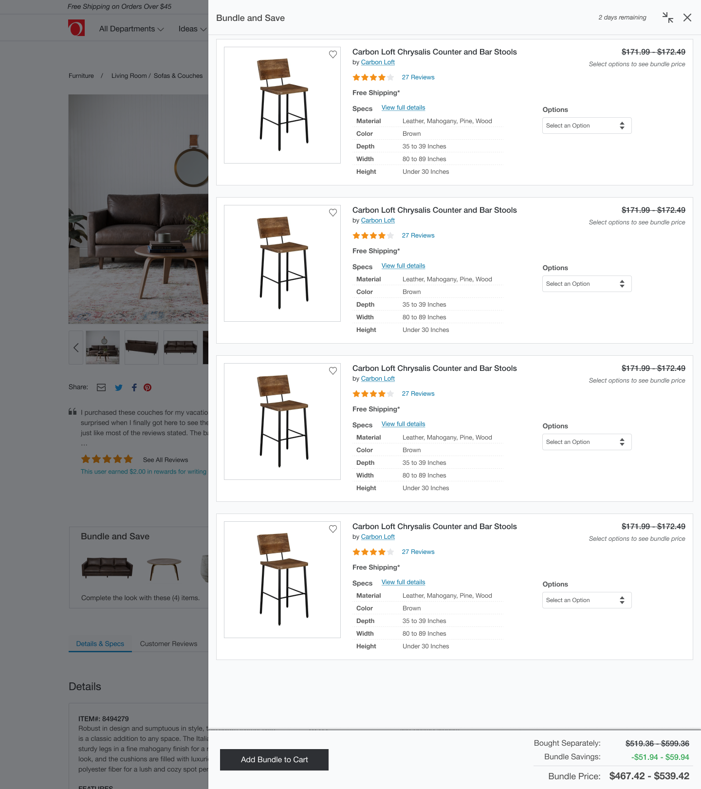
The previous iteration of bundle design featured a flyout that occupied 2/3 of the page. As an initial step in the redesign, I utilized this old design but updated it to include quantity requirements (shown below). This design was then tested via clickable prototype with 5 remote users on usertesting.com.
The user study included 14 think-aloud sub-tasks centered around the main task of selecting options for quantity bundles. I summarized the results of this study (which were fairly middle of the road in terms of task success), and determined that a more significant redesign of the bundle feature was necessary in order to meet the goals of the bundle feature AND the main product page.
process / iteration
The main goal of the bundle feature is to increase customer conversion and cart size by offering discounts on bundled products.
The main goal of the product page is to increase conversion of individual products, and necessarily this goal is achieved when the customer converts on a bundle. However, the product page has secondary goals (e.g. providing the customer with more detailed product information, measurements, reviews and answering questions) which were not met and even prohibited by the previous 2/3 width flyout bundle design.
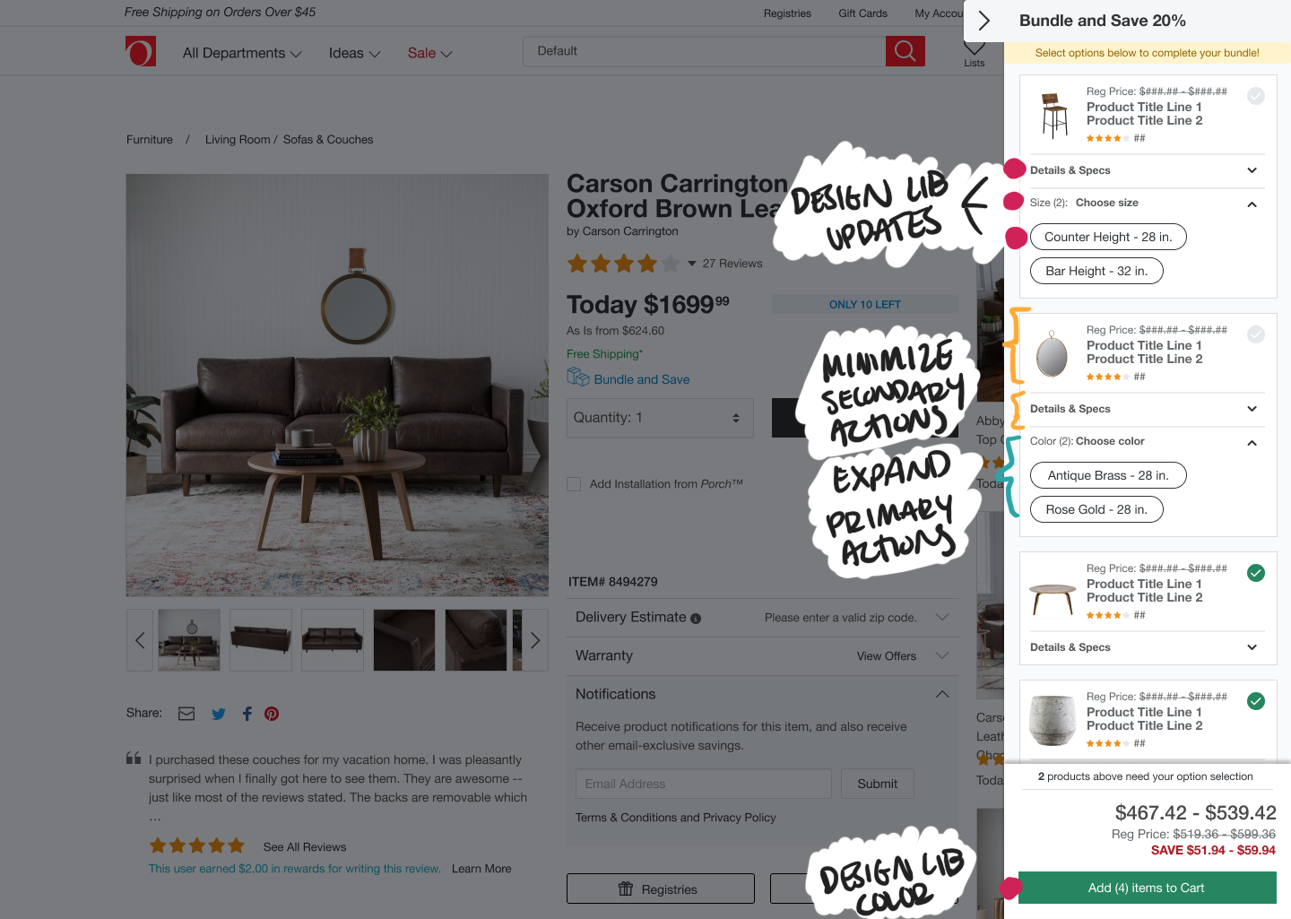
My first and most significant update to the bundle design was to move to a 320px fixed width flyout. The new design works in concert with the main product page to facilitate exploration of both the main product and the products offered in the bundle. This design is also mobile friendly.
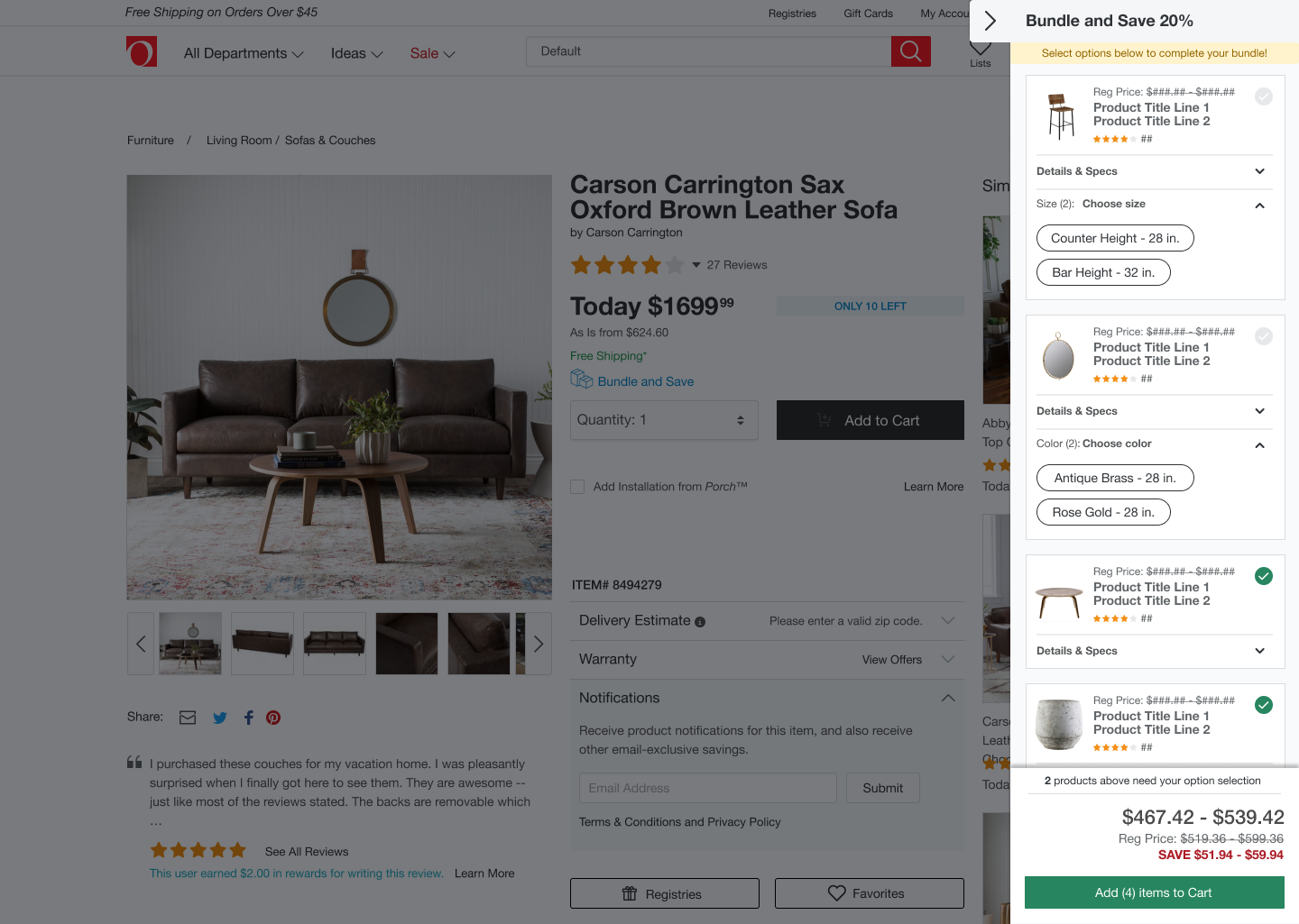
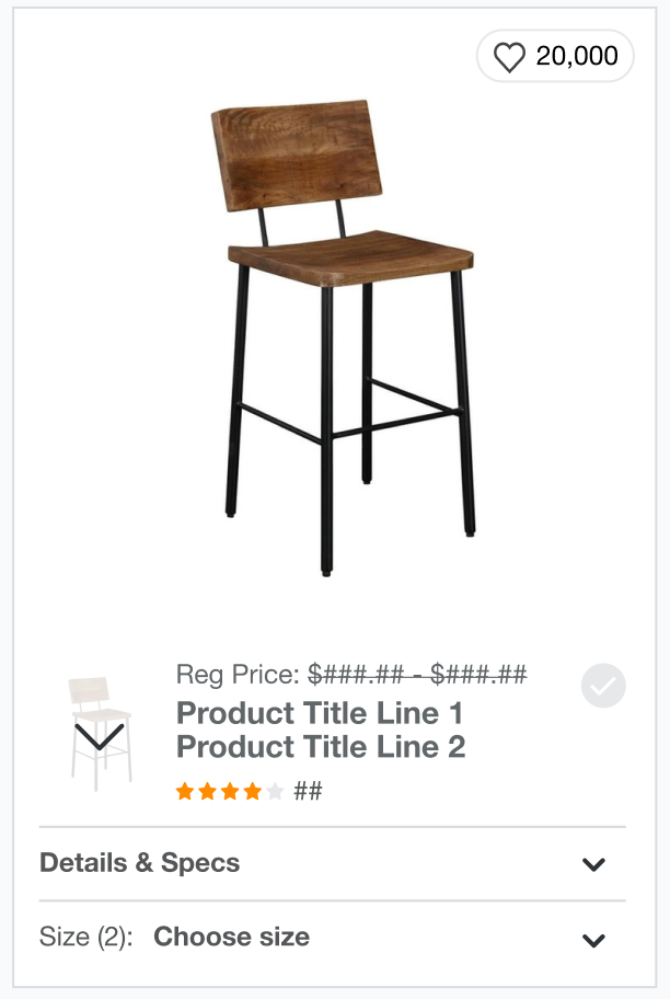
Other significant updates include: (1) utilizing new elements from the Overstock design library, and (2) minimizing the image and product details section (both are expandable within the card).
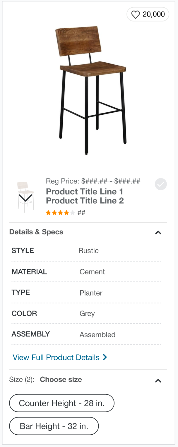
Last but definitely not least, revamping the quantity experience such that it was more effective for users. In order to save the customer time and encourage them to convert with a bundle, I made a number of data-informed updates.
I reduced the required number of steps the customer needed to perform to complete the bundle by auto-applying the option selection to all items in the quantity bundle. This makes the task take fewer steps but does not restrict user choice as they can still select each option individually.
I also added helpful hints and progress information to facilitate easy, understandable option selection on all products.

process / testing
These new features were validated via remote user testing with a clickable prototype, performing better (5/5 participants completed all tasks) than the preliminary user test and previous iterations. The feature deployed test on the Overstock.com product page when I left the position in 2020.